Learn about the components of a product card in e‑commerce and the purpose of each component. You will also see examples of what makes a product card a selling one and conversion-friendly. This guide is almost universal: these product card best practices will be relevant for Shopify, Amazon, Woocommerce, Flipkart, and other platforms and online catalogues. However, each platform has its nuances — consider them when displaying your online store.
- What Is a Product Card in E‑commerce?
- What Tasks a Product Card Solves
- How People Buy: the Main Secret of Sales
- How to Write Product Card Descriptions for Shopify, WooCommerce, Amazon, Flipkart, etc.
- Inventory Management for E‑commerce — Easily & Cheap
- Elements that Help Retain Customers and Interact with the Product Card
- Frequently Asked Questions on Product Cards
What Is a Product Card in E‑commerce?
A product card, also known as a web page with product information, typically contains photos and descriptions of the product, price, and an order button. Depending on the niche and product complexity, additional options may appear on the page: size range, delivery terms, payment options, and quick purchase. The page is interactive — you can click on buttons and photos, and add products to the cart or favorites.
From a business perspective, a product card is a sales tool. It has functional elements that can be influenced to achieve specific results. For example, adding videos or infographics to photos can align product expectations. This can convince more people, leading to more purchases and reducing the number of sales returns.
📦 Managing items across warehouses and channels?
🧊 4 Free Inventory Ckecklists
Learn how to manage stock, set up your warehouse, track barcodes, and build product cards for e‑commerce — even if you’ve never done it before
✅ Inventory management
✅ Warehouse setup
✅ Barcode tracking
✅ E-commerce product cards
What Tasks a Product Card Solves
As a sales tool, a product card pursues certain goals.
Presents the Product in Detail
A product card replaces personal live interaction with the product, so its elements should compensate for this virtual barrier as much as possible. The volume and the way to present information depend on the product kind and its target audience — potential buyers you focus on when developing, positioning, and selling the product. That’s why there’s no universal ready‑made template for a product card.
For example, you definitely won’t be selling drills and auto parts just by photos. Mechanics and maintenance workers need to know the technical specifications. If you’re selling premium cars or diamond jewelry, the image is decisive — in this segment, it’s not about the price but the experience and emotions.
Accounts for User Behavior and Needs
In marketing language, the product card considers various scenarios of choosing and purchasing a product. Scenarios can vary significantly. While some want to buy immediately, others take a long time to choose. People can buy for themselves or search for a proper gift. Buyers can find your products via ads or an email newsletter.
Examples
→ While choosing clothes in a retail store, you can try them on and look in the mirror. But in terms of e-commerce, you can easily make a mistake. To increase sales one has to help a potential client by providing a size chart and tips on how to use it properly, and photos of a clothing item on models of different builds. Moreover, customers expect the following info: colors, fabric type, product care tips, availability in stores, delivery & return terms, etc. This may seem evident but lots of sellers neglect these simple pieces of advice.
→ For customers exploring gift box options, the abundance of choices can be overwhelming. Clarifying the ideal recipient and specifying any restrictions can be incredibly helpful. For example, detailing that a sugar-free chocolate set is perfect for those following a healthy diet but advising against it for individuals with diabetes can streamline the decision-making process for buyers.
Has a Clear Structure and User‑Friendly Navigation
By “clear” structure we mean “convenient”. A well‑structured product card allows customers to quickly determine if a product meets their needs, making them more inclined to purchase. Moreover, the ordering process should be straightforward and intuitive.
Utilizing tools like Google Analytics Heatmap can reveal what elements attract visitors’ attention, including clicks, scrolls, and zooms, offering insights into user engagement with different parts of your site.

Motivates to Purchase
Various marketing elements are used on a product card to retain a buyer’s attention, engage them in exploring the product, encourage them to stay longer in the online shop, and browse its sections.
There are many elements, and we will examine them in more detail later. Here are some of them: zooming in on the product photo, discounts, promotions, and loyalty programs, 3D photos, videos, adding to favorites, reviews, ratings, attractive thermal labels and price tags.
Generate Barcodes and Create Custom Price Tags in Kladana
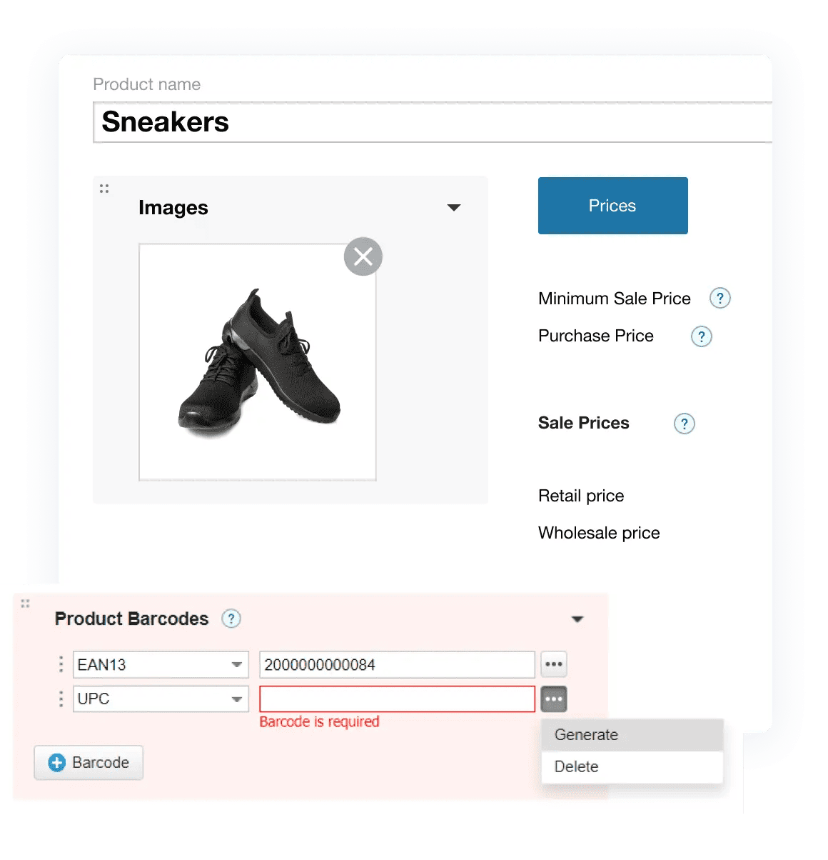
GTIN, EAN‑13, EAN‑8, Code‑128 & UPC barcodes are available in Kladana
- Import, generate, or autogenerate barcodes in a couple of clicks
- Scan barcodes during receiving, shipment, transfer, and inventory counting
- Use templates for thermal labels and price tags or create tailored design
Attracts as Many People as Possible
Competition is inevitable. Standing out can be achieved through peculiar & rare products, unique selling propositions, and user‑friendly interface. But it’s also important to be visible online. Advertising and SEO optimization help with this.
A SEO‑optimized product card makes it noticeable to search engine bots. This means you need to consider what words people use to search for your product and describe it using those terms.
How People Buy: the Main Secret of Sales
Customers purchase not a product but rather a result they are going to achieve using this very item. In other words, a person needs a solution to their problem. However, the solution can be either practical or psychological. Ask yourself — why does a customer need my product? What do they want to achieve with it?
If a person needs a hole in the wall, the drill’s brand may not be very important. If a hole is needed by a maintenance worker, they will think thoroughly about which tool to purchase — not just any drill will do. However, both examples are related to practical situations, head‑driven purchases.
Buying with emotions is like, “Wow, that girl looks so cool sitting with an iPad, drawing so nicely, I’ll also become an artist when I buy this tablet.” Here, logic is disrupted — the customer won’t become an artist this way, but they feel they will. They don’t care about the gadget’s specs — beautiful photos of the iPad and videos with a happy illustrator have a stronger impact because they appeal not to reason, but to the heart.
How to Write Product Card Descriptions for Shopify, WooCommerce, Amazon, Flipkart, etc.
While the core principles of creating a compelling product card remain consistent, the specific requirements and nuances vary across different e‑commerce platforms. From photo guidelines to descriptive content and the utilization of platform-specific advertising and sales tools, understanding these differences is key. Despite these variations, general strategies for designing product card descriptions can be universally applied, whether you’re listing on Shopify, WooCommerce, Amazon, Flipkart, or your own website. Typically, a product card description includes images, specifications, detailed descriptions, and other vital elements, tailored to both your product and target audience.
Purchasing Data
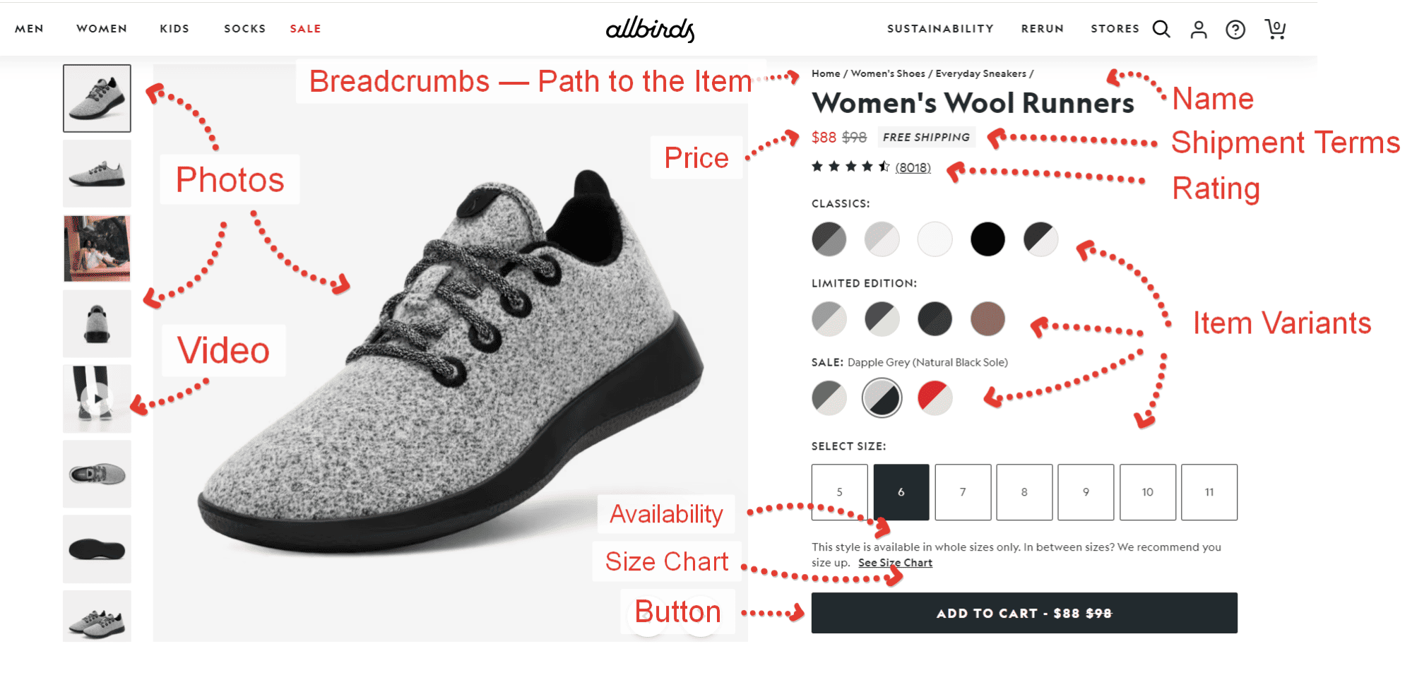
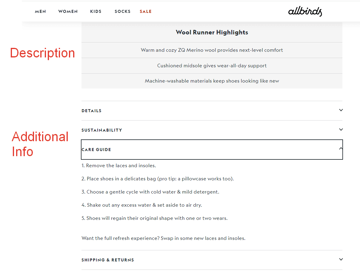
This is an information block on a product card, usually located to the right of the photos, where data necessary to examine a product and make a choice is provided. It typically includes:
- Name;
- Information on product availability — quantity in stock;
- Colour variants, if available;
- Size options, if necessary;
- Price;
- Call‑to‑action buttons — buy, add to favorites & add to cart;
- Size chart, if necessary;
- Product characteristics: composition, collection, care instructions;
- Model parameters;
- Availability in retail stores, if applicable;
- Shipment, returns & warranty information.
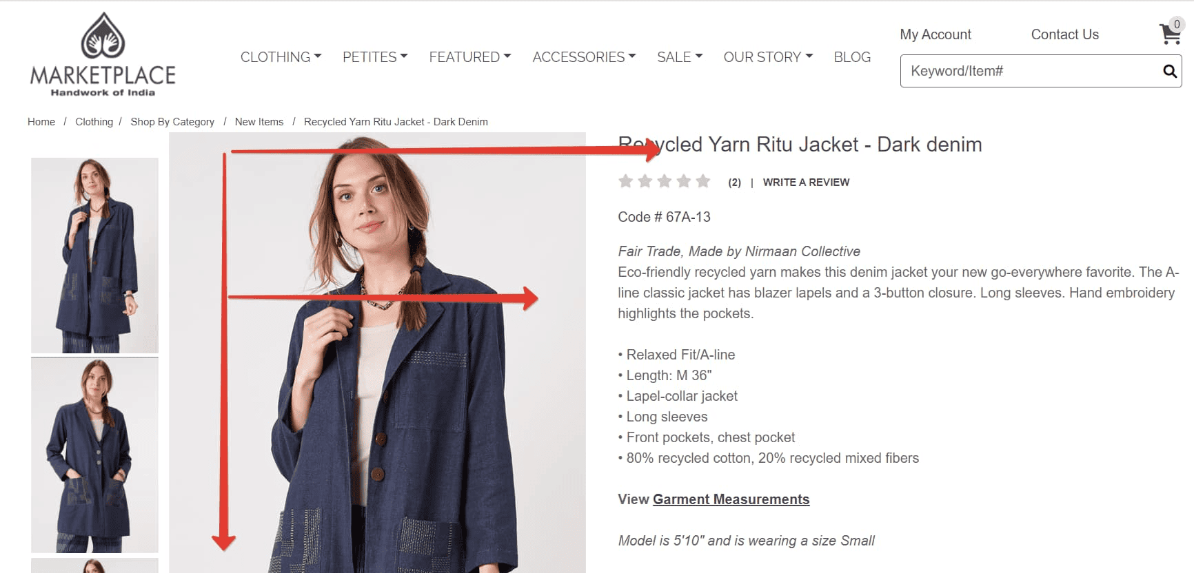
Product Card Elements along the Lines of the Letter “F”
According to numerous research, it was determined that the eyes of a website visitor follow a path resembling the letter “F”. Simply put, people read from left to right. Because of this, product card elements are usually arranged within this visual trajectory. However, in some cultures, it might be different — it’s important to consider perception peculiarities.
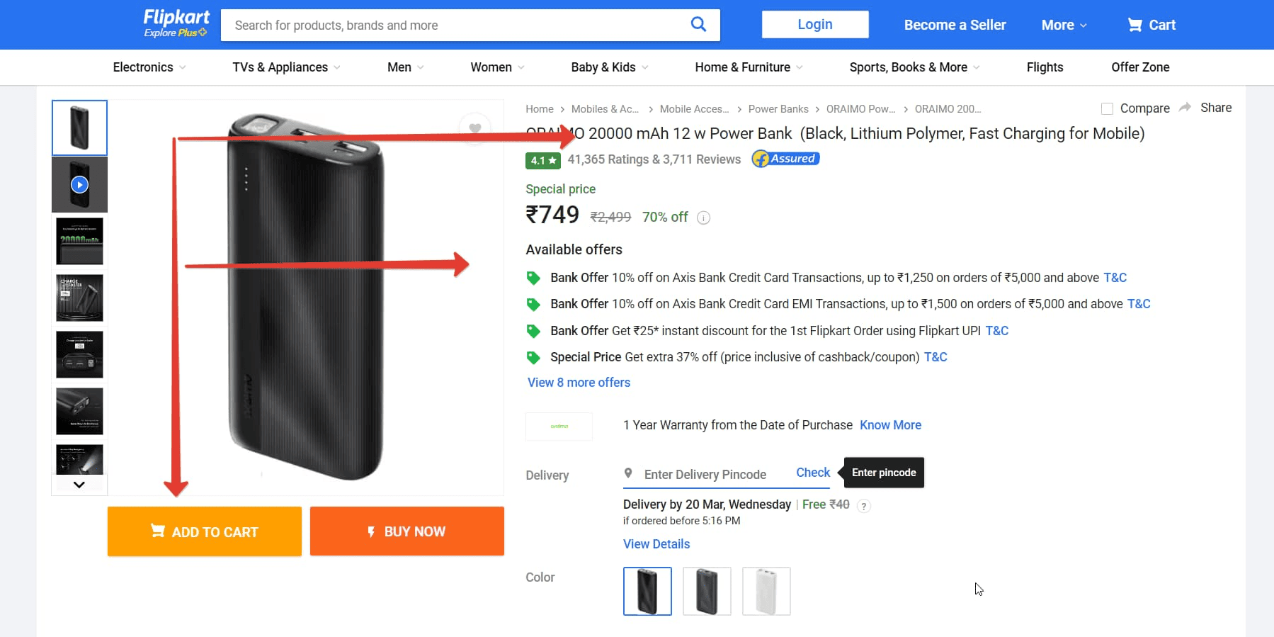
Product Name
This is a brief name of the product, which also contributes to its indexing in web search. A name can be crafted following the scheme: product type + model + collection + important characteristics. Often, this is enough.

Product Photos
The seller’s task is to create an accurate representation of a product through photos: to show it honestly and not to inflate expectations. The main photo should be informative, and appealing, but not overloaded with visual elements. It will be displayed in the catalogue — so, this is the “face” of a product. For example, if you’re selling sneakers, show them in detail from different sides. Then, you can show how they look on a person, how they fit into an outfit. Allow customers to rotate a 3D model.
For marketplaces, this works a bit differently, where infographics are often more appropriate. For instance, the main photo could showcase the key benefits or important features of the product, the content of a bundle, etc.
Photos should be of high quality. Nowadays, most smartphones and monitors support FullHD, so upload high‑quality photos. Viewing blurry pixels instead of a product is simply unpleasant. Moreover, it might raise questions about the seller: if they upload such photos, how good is their product? Is the store even trustworthy?
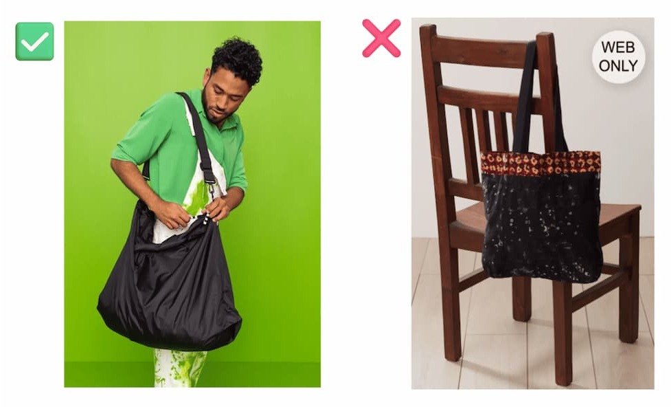
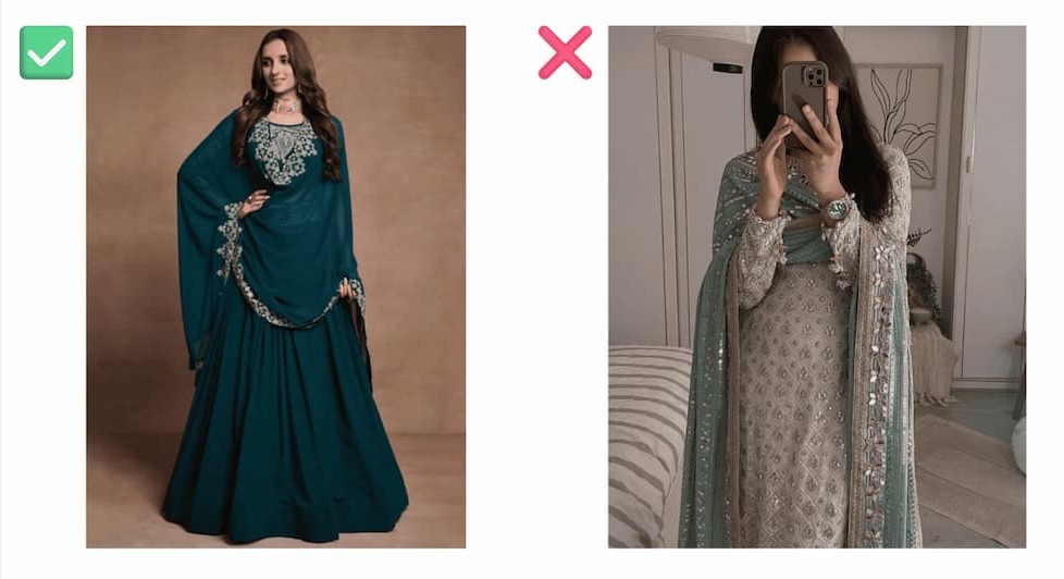
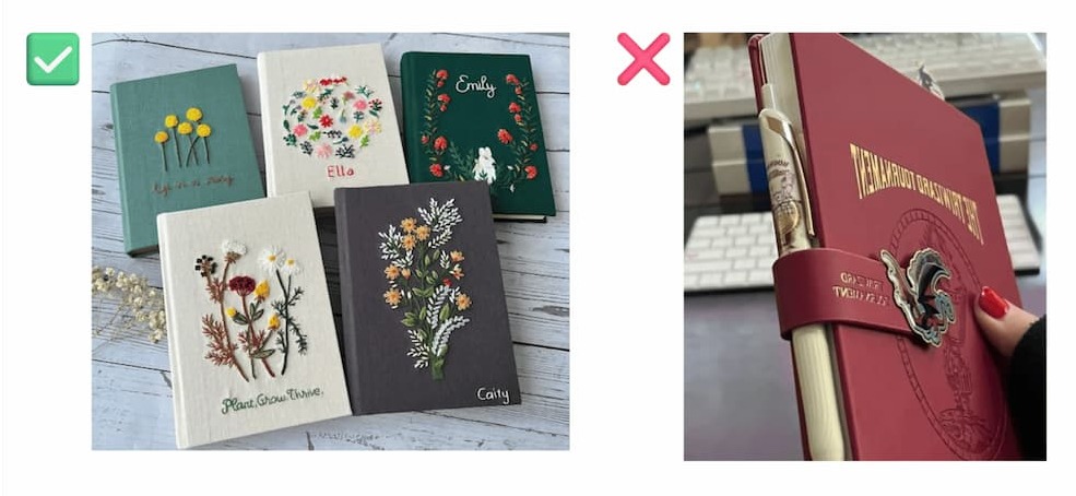
The background is preferably light and solid. It doesn’t distract attention and doesn’t interfere with viewing a product in detail. If a customer uses a dark theme in their browser, products on a light background won’t get lost. For instance, clothing looks more upscale this way.
However, this advice may not suit certain categories: interior items, scarves & jewelry are better shown in real use. Also, not all light-coloured items work with this — sometimes placing them on a contrasting background makes sense.
Important details that influence the purchase are highlighted. Take a macro photo of fittings, fabric texture, neat seams, wristwatch hands, etc. Add an explanation of why this or that element is important or how it will be useful. Include a size chart or the rules for returns and exchanges, and care instructions for an item.
Product Videos
Before shooting a video ask yourself: “What else can I show and tell about the product with the help of video?” A good video can help a customer envision themselves and typical situations of their life: in a more beautiful & desirable but realistic way. Show how the product will solve a problem or in which situation a customer will use it, how it will make their life easier, or more beautiful. Demonstrate the properties of the product that can only be understood through video.
Examples of what to show in a video:
- For a stick vacuum cleaner: how it lifts the carpet lint, how to change attachments, how the dust on the floor becomes visible with the help of lighting.
- For the bed linen: how one can quickly make up a bed with it, it requires no ironing and looks beautiful in the bedroom.
- For an electric grater: how it looks when a person is holding it, whether it weighs a lot, and how quickly it slices potatoes, cucumbers & carrots.
In this video, the operation of the air purifier, typically invisible to the naked eye, is made apparent through visualization techniques that demonstrate the device’s effective range in cleaning the air.
An actress demonstrates the customizable design of a sofa by changing the fabric and colour, and showcasing its utility in multiple real‑life scenarios. This approach helps viewers imagine how the sofa could enhance their own living spaces and adapt to their lifestyle needs.
Price
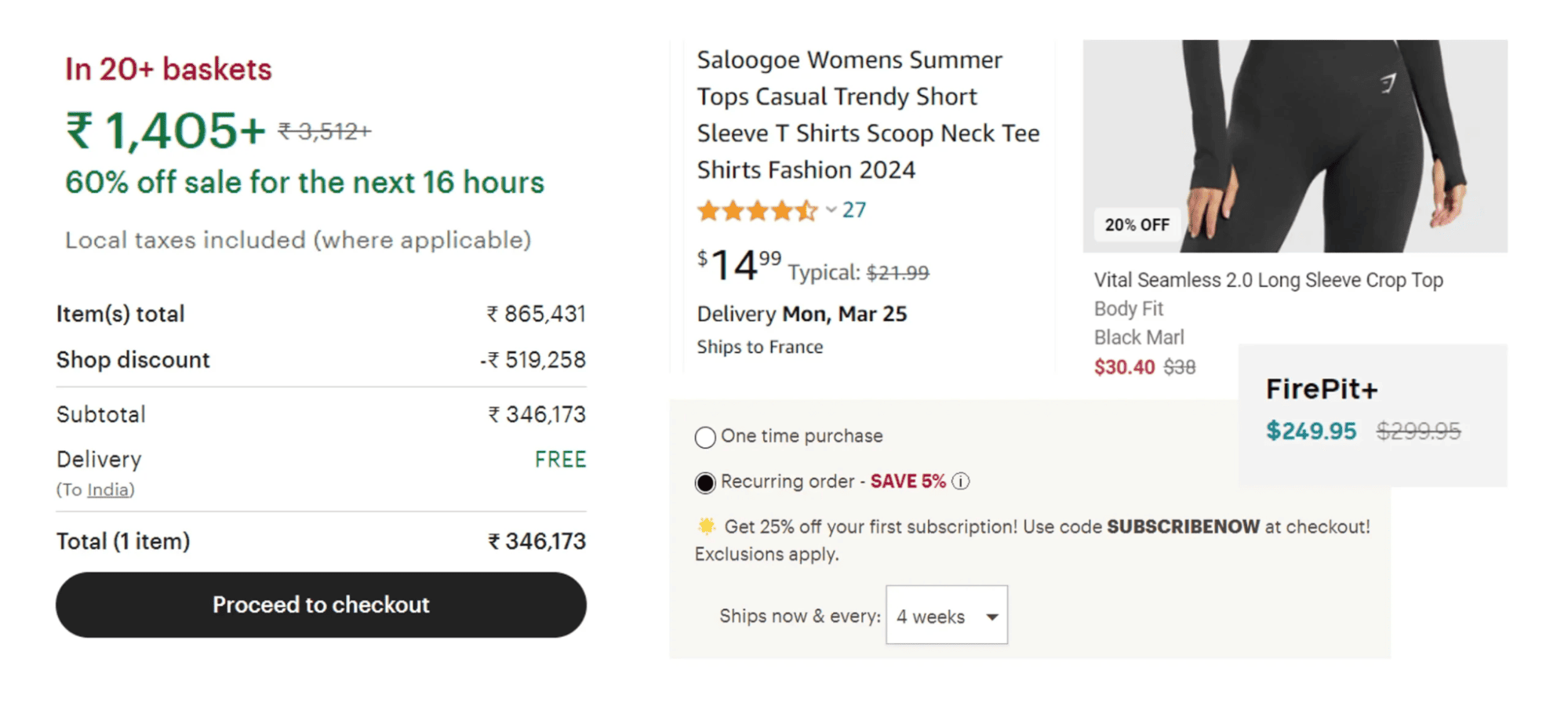
Indicate the regular price and the current sale price if there is one. In case you’re offering a discount, visually display the percentage saved through the promotion. Marketplaces, for example, use this technique very actively: they indicate the benefit or highlight the price difference even in the cart.
“Buy” and “Share” Call‑to‑Action Buttons
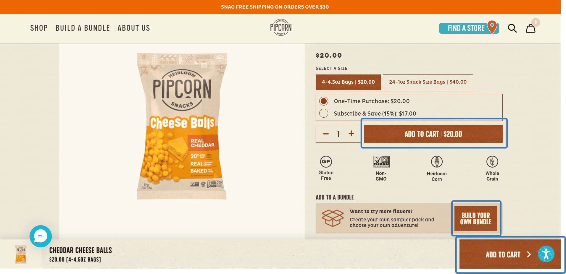
The “Buy” button represents the desired action. It should be large, bright, and noticeable. There are also “Buy in 1 click” and “Quick purchase” options. Often, there are two buttons for targeted actions: “Instant Purchase” and “Add to Cart.”
The “Share” button usually appears as a small icon. Nonetheless, it’s indispensable: using it people recommend products to friends, hint at partners about purchases, or save links in chats with themselves.
Other buttons that might be present but are less noticeable include “Save for Later” or “Add to Favourites” and “Compare.”
Product Description
An effective product card description helps customers make buying decisions. To create a good description, think about how it will assist a person. You can start by finding the key queries — words that people use to search for the product — and then craft them into a coherent text.
Put yourself in the buyer’s shoes — what would be important to you when deciding whether to purchase a product or not? You can find a similar product of your competitor: the drawback of someone else’s description will immediately catch your eye.
How to Write Product Descriptions that Sell Well
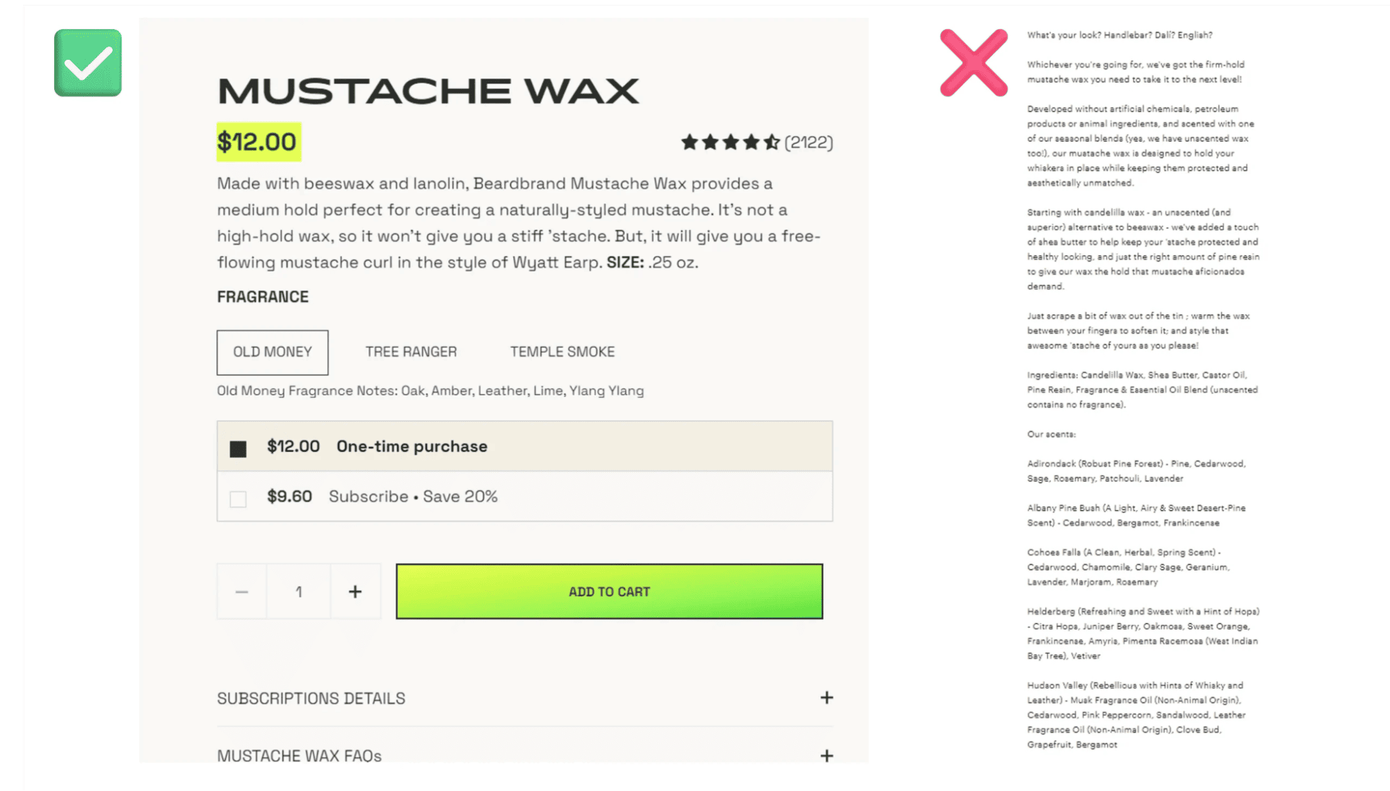
In simple terms. Keep in mind that a human being is going to read your text. Use language and examples that can be comprehended by your target audience. Instead of “the product’s aluminum fastenings are durable and manufactured according to high standards,” write “the fastenings are made of strong aluminum: even if you hit them with a hammer, the product won’t bend.”
With keywords — SEO can boost your shop in web search. Don’t spam, meaning don’t repeat the key queries in every sentence. Use only relevant keys and be moderate. Be sure to use LSI words, in simple terms — various words related to the topic, so the text is interesting, readable, and explores the topic from different angles.
Constructed in short, simple sentences. 5‑6 words are ideal. Sometimes a bit more words are okay, but don’t overdo it. Short sentences are easier to understand and more likely to be read, especially from a smartphone screen.
Concise. If the sales text fits on one mobile screen, many will read it and might even delve into it. If the text stretches over 2‑3 screens — only a couple of meticulous people will read it to the end.
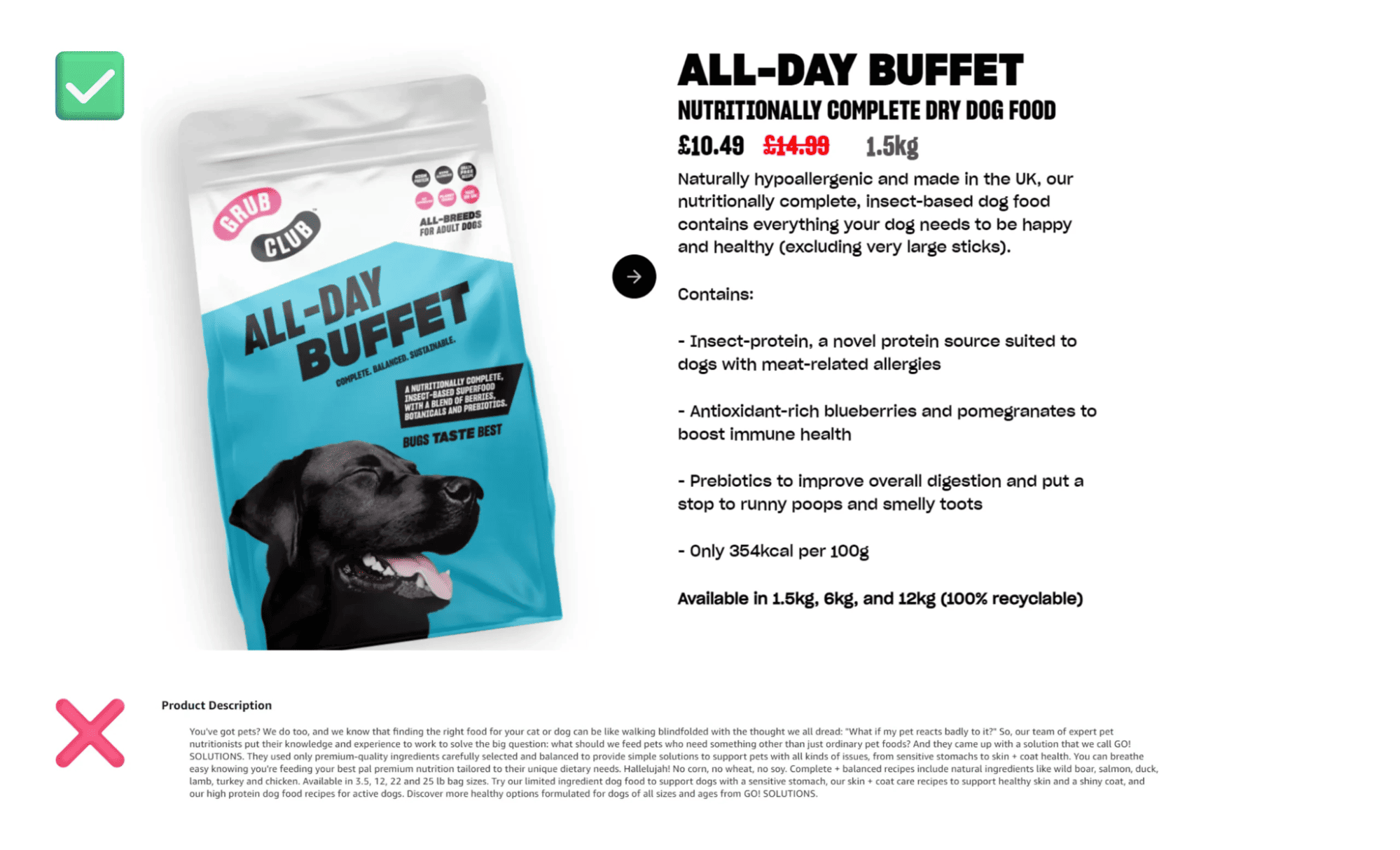
Common Mistakes in Product Card Descriptions
❌ Using the product description solely for SEO promotion
In other words — writing texts with dozens of keywords used one after the other. Here, you lose the opportunity to communicate with the customer on a “human‑to‑human” level, and you miss out on sales. Plus, the SEO promotion turns out to be mediocre at best if the description is simply stuffed with keywords — the product card might get penalized by the marketplace.
Marketplace and browser algorithms now pay attention not only to keywords but also to so‑called LSI phrases — those that better reveal the topic, and make the text understandable and varied, helping the customer better grasp the essence of the product.
❌ Deliberately using keywords with mistakes in the text to attract more organic traffic to the product card
Literacy is digital politeness. Some customers might doubt your competence due to illiteracy, and the marketplace might penalize your product card. Note: even if you type a query with a mistake in the search bar, the marketplace will automatically correct your mistake and show you the results for the correct query. That’s another reason why using keywords with grammatical errors is pointless.
Path to the Product, or Breadcrumbs
This is also called a navigation chain. It’s a path a user has taken from the main page to the current one. That is, which sections, subsections, and categories they entered to find a product.
Breadcrumbs are needed so that a customer can easily go back a step without losing all the set search settings. It also helps to keep the person engaged if the product being viewed is not suitable, but they are ready to look for another one in the same category.
Shopping Cart
Often, purchases are not limited to a single item, and the product range is large. It’s convenient to add them to a virtual cart, from which you can later pay and choose delivery options. You can also use tools to activate an abandoned cart: send users emails, push messages, or WhatsApp messages reminding them of the items in their cart — informing them that they’re about to run out, there’s a discount on them now, etc.
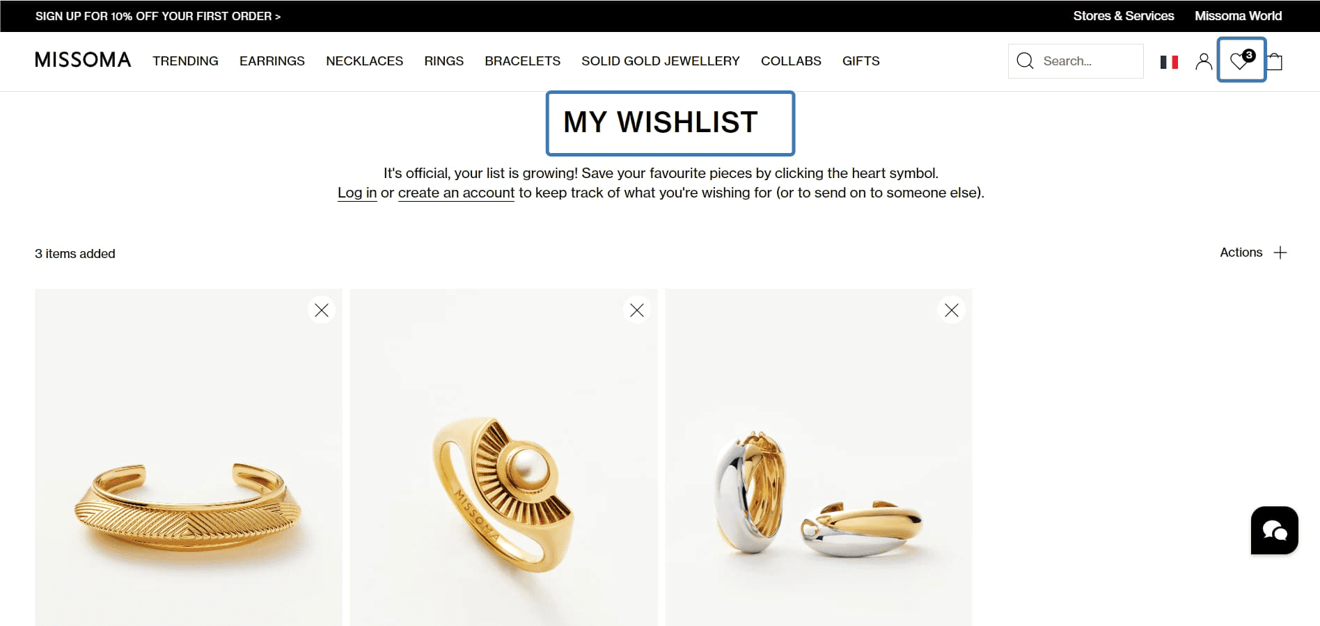
Favourites
This is a list of products that the customer liked but did not buy, set aside for later, or wants to choose one item among plenty. It’s created when a user clicks a corresponding button on a page. By opening the list, the person reviews the liked items and decides whether to make a purchase. The list can help generate additional sales in a similar way as with the abandoned shopping cart.
Variants, Colours & Size Chart
The space for this section is often located between the product name and the price. Typical examples are the following:
- For clothing — colours, sizes & fabric type
- For tools and spare parts — dimensions & function
- For furniture — kits, material type, colours & dimensions
Button Design
Usually, this section is presented in two versions: a small button for each option or a dropdown list with options. Small buttons are suitable if you have few product variants. However, a dropdown list is preferred — it looks neater and doesn’t take up space.
Size chart
This is relevant for websites selling clothing or footwear. The chart will help correctly measure oneself and choose the right size. The more detailed this section is, the better. The size chart should be displayed on the product card. There should be no transitions to other pages or PDF files. Additional actions lower the conversion rate.
Testimonials
Reviews and ratings are, in marketing terms, related to social proof. People who have seen reviews of a product from other customers are more likely to buy this product. We usually trust the opinions of other people. Moreover, often products are photographed or shot in the most favourable light, in beautiful interiors or on slim models, while reviews help see the product in reality, with real people using them.
In the corporate blog of Reputation X — a company that specializes in online reputation management — one can find statistics that support the idea of trust:
- 63% of customers order from an online store where there are reviews from others;
- 88% of customers take reviews into account when making a purchasing decision.
Don’t delete fair negative reviews — they instill trust. And the way you react to these reviews matters. For instance, if a company replies that it’s a customer’s or vendor’s problem, insults a customer, and blames them for everything, such a company won’t seem trustworthy. On the contrary, if a company admits its mistake, sincerely apologizes, makes an effort to scrutinize an issue, and eventually solves the problem (return the money, give a promo code, etc.), that’s exemplary behavior.
Product Rating
Based on the number of orders, customer reviews, and the number of users currently studying the product card, consumers can determine how much they can trust a seller.
Shipping Information
Ideally, the cost and delivery time should be specified. This will help avoid complaints from customers who want to receive their purchases by a certain date and reduce the number of abandoned carts. Free shipping usually increases conversion.
If there is a lot of information, a separate page is created and linked to it. However, it’s better not to do this as it can lower conversion. Instead, place information in the website’s footer, in the purchase area on the right, or in a separate pop‑up — just don’t lead the customer away from the page.
SKU
This is necessary for user navigation. It will be useful for a customer if they need to ask a consultant whether the product is available at a particular location.
Inventory Management for E‑commerce — Easily & Cheap
If you’re selling online, at some point you’ll end up with multiple sales channels. Kladana ERP will help you avoid confusion and control the processes in one app. Orders from the website, marketplaces, and social networks can be managed in all‑in‑one ERP without unnecessary hassle and switching between numerous platforms.
Segment customers and view sales funnels. Connect integrations with Shopify and WooCommerce. Or use our free Online Order App. It allows you to upload a catalogue with your goods, generate catalogue links with different prices, send them to customers, and get sales orders automatically.
Product stock levels across all platforms are updated automatically. This will minimize order cancellations. And you’ll always be informed about how many products are in stock and what goods need to be purchased.
Order management right in the app. Reserve products, assign managers, monitor transactions, change order statuses, and create shipments. It’s convenient to generate documents such as invoices for your counterparties. Get automatic alerts.
View all the necessary reports. As your company grows, you’ll need to track analytics on sales volume, profit considering all costs, and product stock levels in different warehouses.
Let’s give an example of a couple of reports that Kladana’s customers use most often.
Stock Levels by Products
Shows the total number of products, including their variants. You can filter the data by days in stock, expiration date, warehouses, size, material, etc.

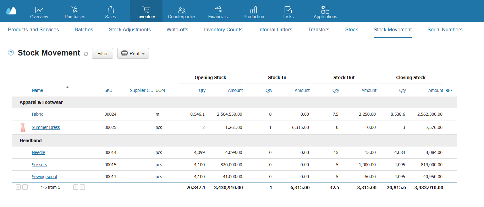
Stock Movement Report
Allows one to monitor all transactions such as receivings, shipments, sales returns, write‑offs, etc.
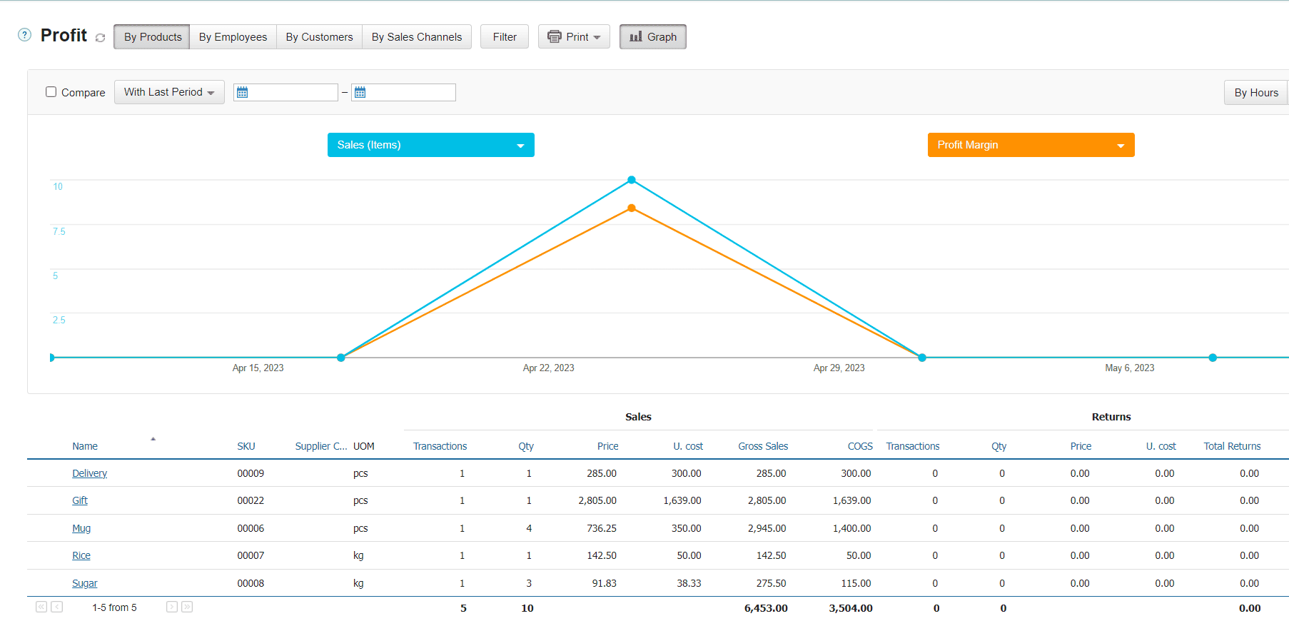
Profitability Report
It displays the cost, price, and number of sales of each product along with the profit. The report will help assess income and profitability.
Elements that Help Retain Customers and Interact with the Product Card
You’ve likely encountered these elements more than once when ordering goods online.
Infographics
Infographics can be used to describe additional services or explain shipment details, for example.
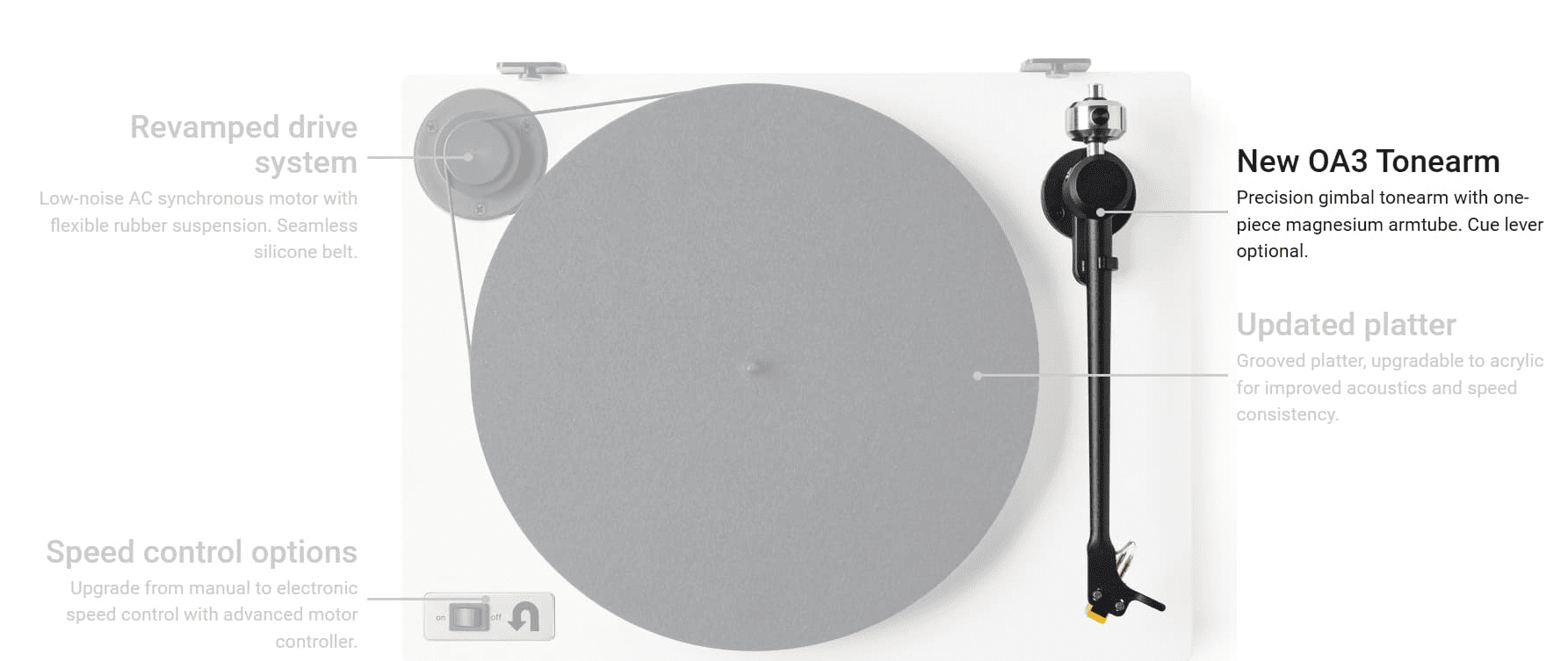
When preparing product card design, stick to minimalism — this way, a product will have a neat appearance and give the impression of being high‑quality.
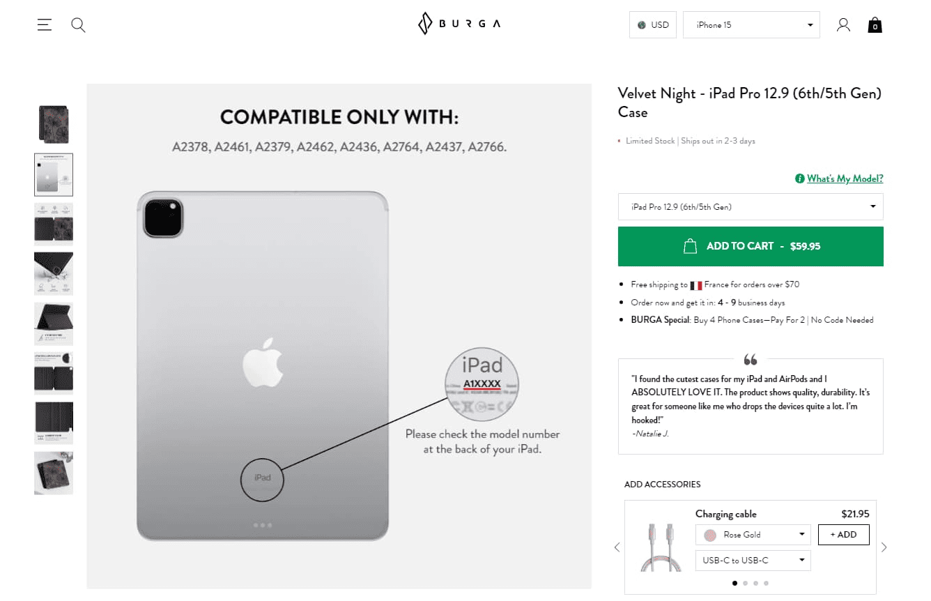
Do not write everything in a single image. It’s inconvenient to read and can be confusing. Unfold your points fully and sequentially in each image, following the rule: one photo — one notion.
Avoid writing product card descriptions in small fonts. This partly relates to the previous principle. A lot of small texts will not be appealing to read: customers will leave your page, or simply get confused.
Add icons, lists, numbers, diagrams, and arrows. These visual presentation techniques help structure information and communicate it faster. Remember the instructions for toys in Kinder Surprise — they only use pictures, arrows, and numbered steps for assembly.
Do not write in light colors on a light background, as it’s hard to read. It’s better to use contrasting colors, but within reason: writing in green on a red background is also not advisable.
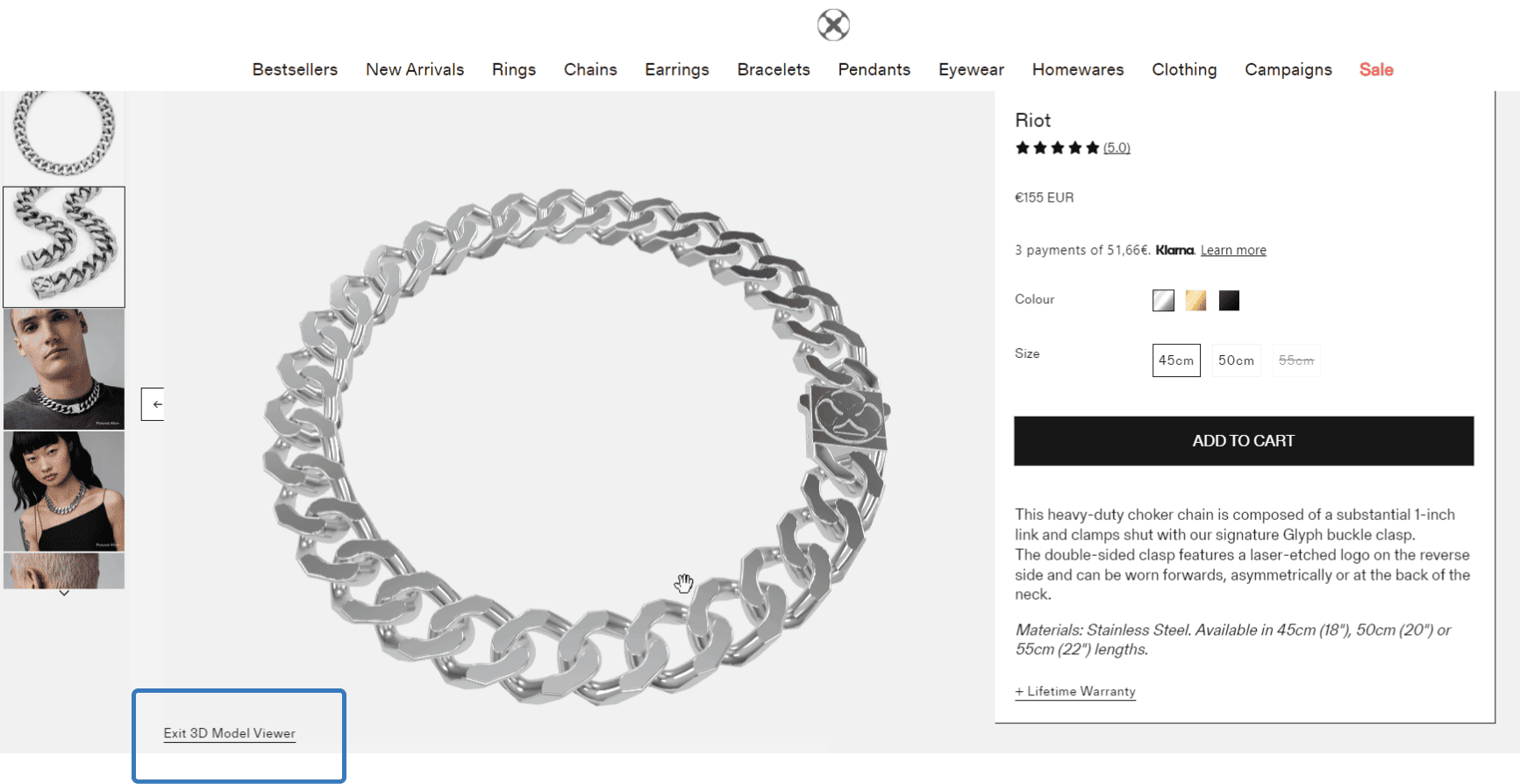
3D Pictures
Especially handy for apparel, accessories, jewelry, shoes, and other items for which details matter.
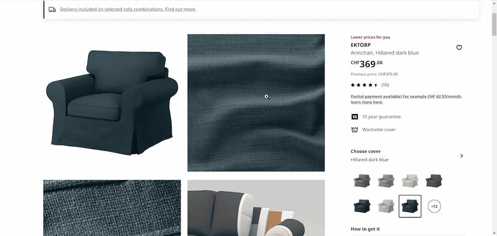
A Magnifying Glass, or Photo Enlargement
The same thing here — a customer can examine an item thoroughly. A great tool for luxurious items especially. Mind that in this case, pictures must be of high quality.
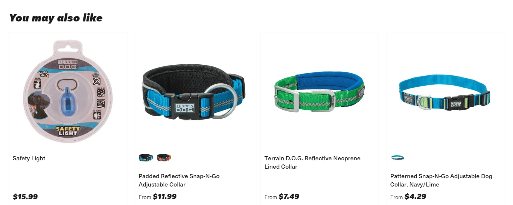
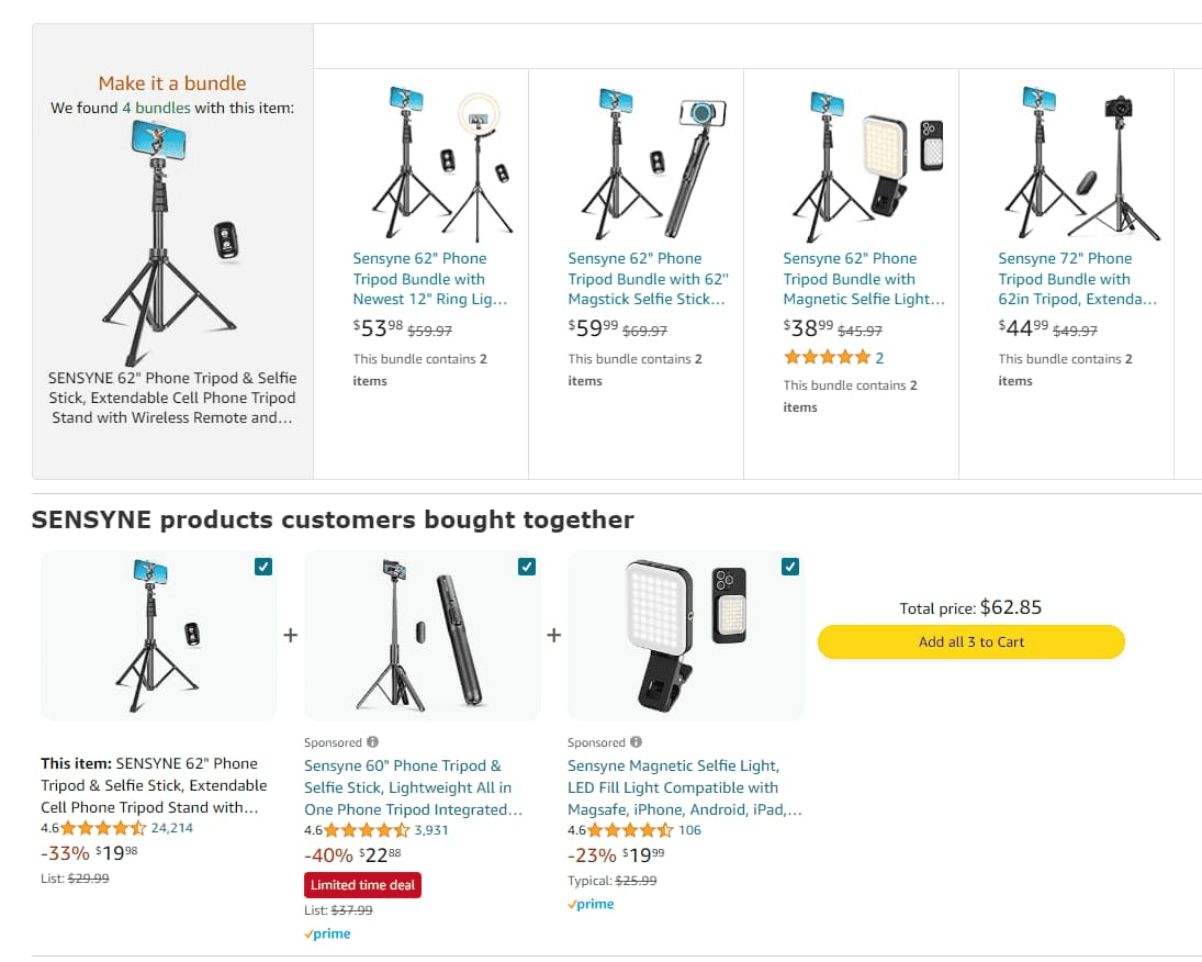
Recommendations
This section can be called differently — “Customers Also Bought”, “Other Also Viewed”, “You May Like”, “Your Personal Recommendations”, etc. These items are chosen according to user behaviour — what products they viewed, added to the cart, bought, etc. This helps to increase the average check.
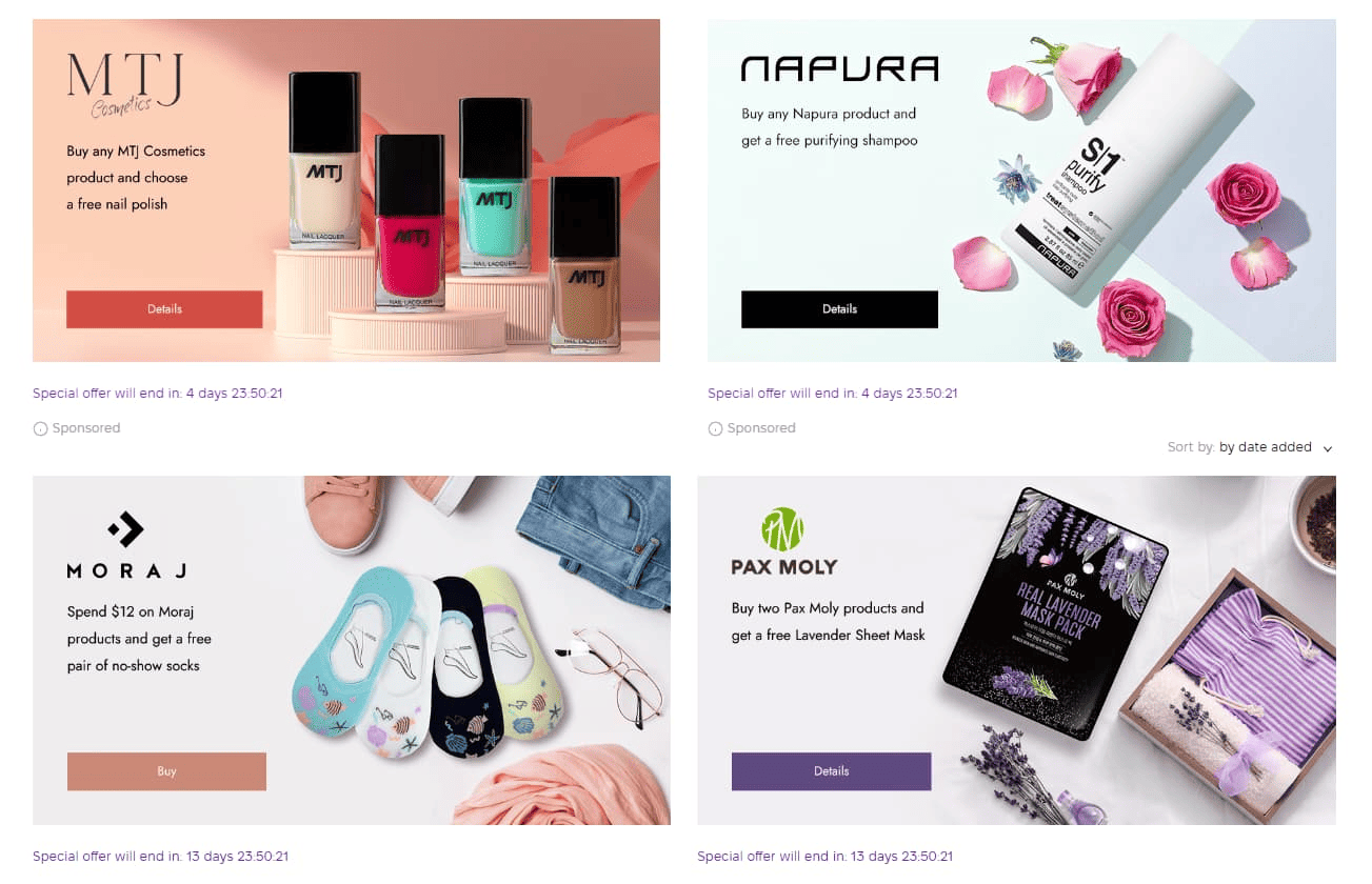
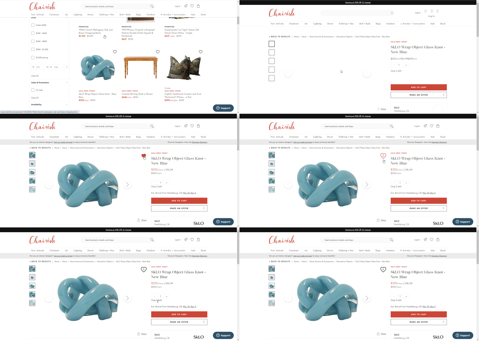
Timers
Time limit offers are a versatile tool. However, you should not use it all the time, otherwise it will reduce credibility.
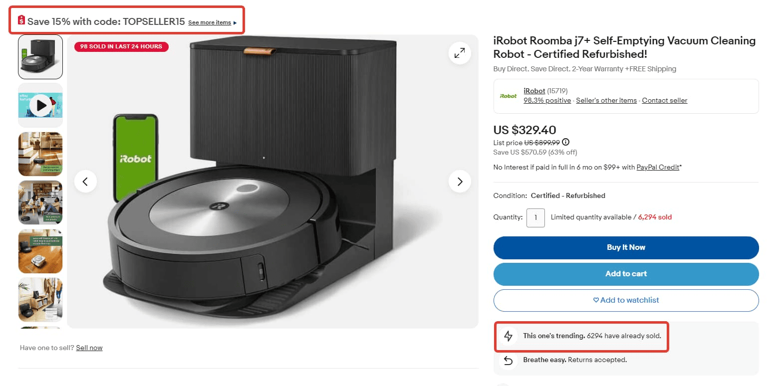
Demonstration of Demand
Sometimes it is useful to include information about product card views or the number of people who have bought the product.
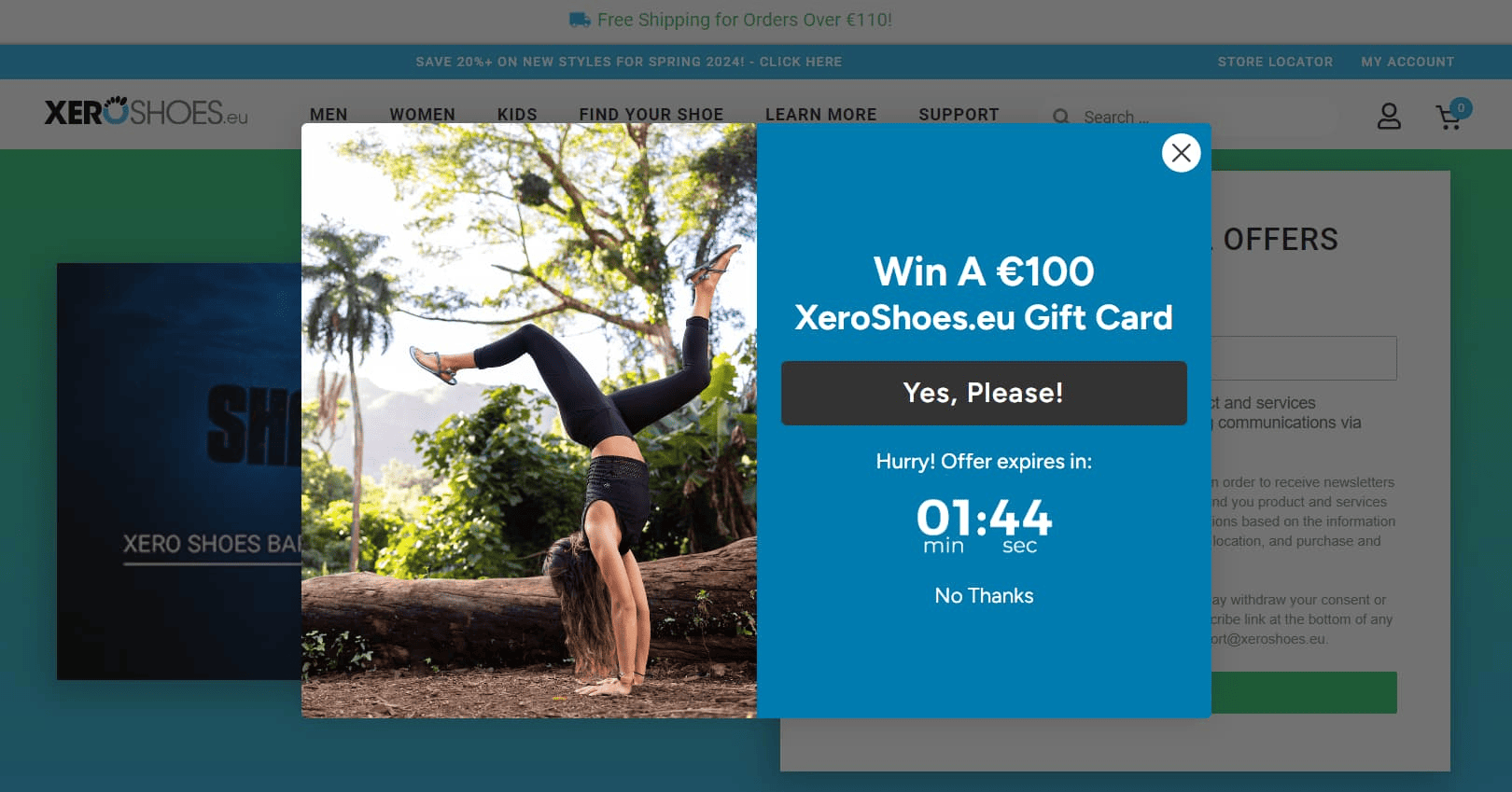
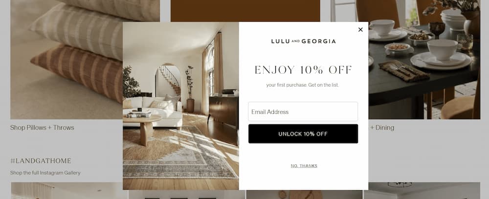
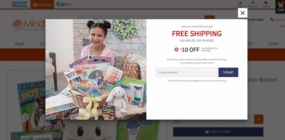
Pop‑ups
Spin the wheel, refer a friend, and get a discount, 1+1=3, first order promo code, subscription discount, and other promotional offers can be applicable.
SEO Optimization of Product Card Descriptions
Effective search engine optimization and high conversions in an online store can be aided by skilled SEO optimization of product card descriptions. Here are five things you need to do to achieve quality optimization.
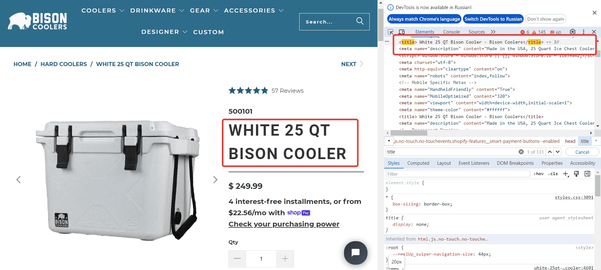
Metadata: title, description, and h1. If your CMS allows, use templates to generate metadata. Ideally, it should be as follows: product name + parameters + commercial search queries — delivery, buy, price, reviews, and online store.
Meta tags for images. Fill in the alt and title attributes for each image. The names should match the content of the photo and include one or several keywords. This helps search engine bots index the content and promotes the site to the top of search results.
Microdata for product card descriptions. Special tags provide important information about the product in the search snippet, and structure data for bots and users. Set up microdata using the Product and Offer tags. You can also add the Review tag to display reviews and AggregateRating to show ratings.
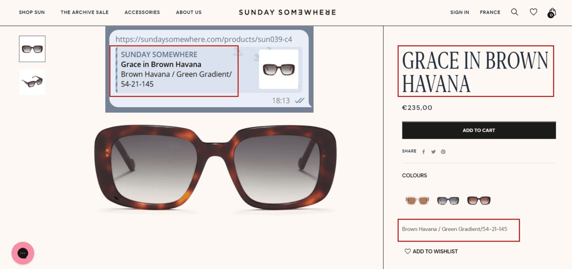
Text Optimization. The textual content on product cards must be unique. Do not copy it from competitors — this can severely negatively impact promotion.
Write a brief product card description and a detailed text that unfolds when clicking a button. Place details, specifications, and product variants in the purchase area under a second‑level heading, incorporating low- and medium‑frequency queries from Google Trends and other SEO tools into the text. Where possible, add internal linking.
Mobile-Friendly Version. Optimizing your site for mobile devices is one of the key ranking factors. Work on an adaptive version of the product cards. Products should display correctly on screens of various sizes and be convenient for viewing. Conduct a page load speed test and optimize if it loads slowly. The content should be the same in both the desktop and mobile versions of the site.
Frequently Asked Questions on Product Card Descriptions
Crafting effective product cards is essential for enhancing user experience and boosting sales in e-commerce. Here are concise answers to common questions.
What is a product card in e‑commerce?
A product card is a digital representation of an item on an e‑commerce platform, displaying key details like the product name, image, price, and a brief description. It serves as a quick overview to inform and entice potential buyers.
What should be included in a product card?
An effective product card typically includes:
- Product Title: Clear and descriptive name.
- High-Quality Images: Visuals from multiple angles.
- Price: Current cost, including any discounts.
- Brief Description: Key features and benefits.
- Call-to-Action (CTA): Buttons like “Add to Cart.”
- Customer Reviews: Ratings and feedback.
These elements collectively provide a comprehensive snapshot to aid purchasing decisions.
How can I optimize product cards for SEO?
To enhance SEO:
- Use Relevant Keywords: Incorporate terms like “product description card” and “product card design” in titles and descriptions.
- Write Unique Descriptions: Avoid duplicate content across products.
- Optimize Images: Use descriptive file names and alt text.
- Include Structured Data: Implement schema markup to help search engines understand product details.
These practices improve visibility on search engines.
What are common mistakes in product card design?
Avoid these pitfalls:
- Low-Quality Images: Poor visuals deter buyers.
- Lack of Information: Insufficient details can cause hesitation.
- Cluttered Layout: Overloading with information overwhelms users.
- Unclear CTAs: Ambiguous buttons reduce conversions.
Focusing on clarity and user experience helps mitigate these issues.
How do product cards differ across platforms like Shopify, WooCommerce, Amazon, and Flipkart?
Each platform has unique features:
- Shopify: Offers customizable templates and apps for tailored product cards.
- WooCommerce: Provides flexibility through plugins and themes within WordPress.
- Amazon: Has strict guidelines; emphasizes high-quality images and detailed descriptions.
- Flipkart: Requires adherence to specific listing standards and quality metrics.
Understanding platform-specific requirements ensures effective product presentations.
How can I make my product cards more engaging?
To enhance engagement:
- Use High-Quality Images: Show products from multiple angles.
- Highlight Benefits: Focus on how the product solves problems.
- Incorporate Social Proof: Display customer reviews and ratings.
- Ensure Mobile Responsiveness: Optimize for various devices.
Read‑alikes
Inventory Management Guide for Beginners: Techniques, Challenges, Best Practices, and Trends
Inventory Counting: Step‑by‑Step Guide on How to Conduct and Access the Results
Inventory Management in Excel: Free Template and a Step‑by‑Step Guide
10 Common Inventory Management Mistakes: Challenges, Risks and Solutions
